Project 3: Redesigning DB Navigator
A redesign of Deutsche Bahn's official transit app, improving how real time travel information is communicated to users.
Role
UX Designer
Industry
Transportation
Duration
3 Months
OVERVIEW
The app is capable.
The information isn't legible.
DB Navigator is Deutsche Bahn's official mobile application serving Germany's national rail and regional public transport network. It sits at the intersection of journey planning, real-time travel information, and ticket commerce. A combination very few transit apps in Europe fully own end-to-end.
Core jobs-to-be-done
"Get me from A to B on the right train at the right time"
"Tell me if my train is late and what to do about it"
"Let me buy and show my ticket without friction"
"Help me navigate disruptions without panic"
Key Strength
DB Navigator's greatest advantage is its data infrastructure. It has direct access to Deutsche Bahn's real-time train data, platform information, and ticketing system.
CORE PROBLEM
The problem is not data quality.
The problem is how that data is communicated to users.
USER FLOWS

PROBLEM DEFINITIONS & SOLUTIONS

Problem 01: Missing Delay Delta
Scheduled and real-time times are displayed side by side with no calculated difference, forcing users to mentally subtract two numbers under time pressure.
Solution: Show a +X min badge inline with the real-time time, identical to the industry standard across all major transit apps.
Why it matters: A user checking their phone on a platform has seconds, not minutes. Manual calculation is poor UX.

Problem 02: Invisible transfer risk
When a connecting train is delayed, the app shows no transfer risk warning and offers no alternative route, leaving users without guidance at the most critical moment of their journey.
Solution: An inline risk panel showing remaining transfer time in minutes, with a direct link to alternative connections.
Why it matters: Missing a transfer damages user trust in ways that go beyond inconvenience.

Solution: A bottom sheet surfacing the most common ticket options first, with additional options one tap deeper.
Why it matters: More choices increase task completion time and error rate.
Problem 03: Cognitive overload in ticket purchase
Tickets can be purchased mid-journey, making speed critical to avoid penalty fares. Yet a user buying a simple adult ticket is met with a screen full of largely irrelevant options. Too many steps, too much information at once.
BEFORE

Problem 04: Inconsistent Color Logic
A departure running 1-2 minute late is shown in green while a delayed arrival on a different connection is shown in red. Both are delayed. The color encodes data freshness, not delay status, a distinction invisible to users.
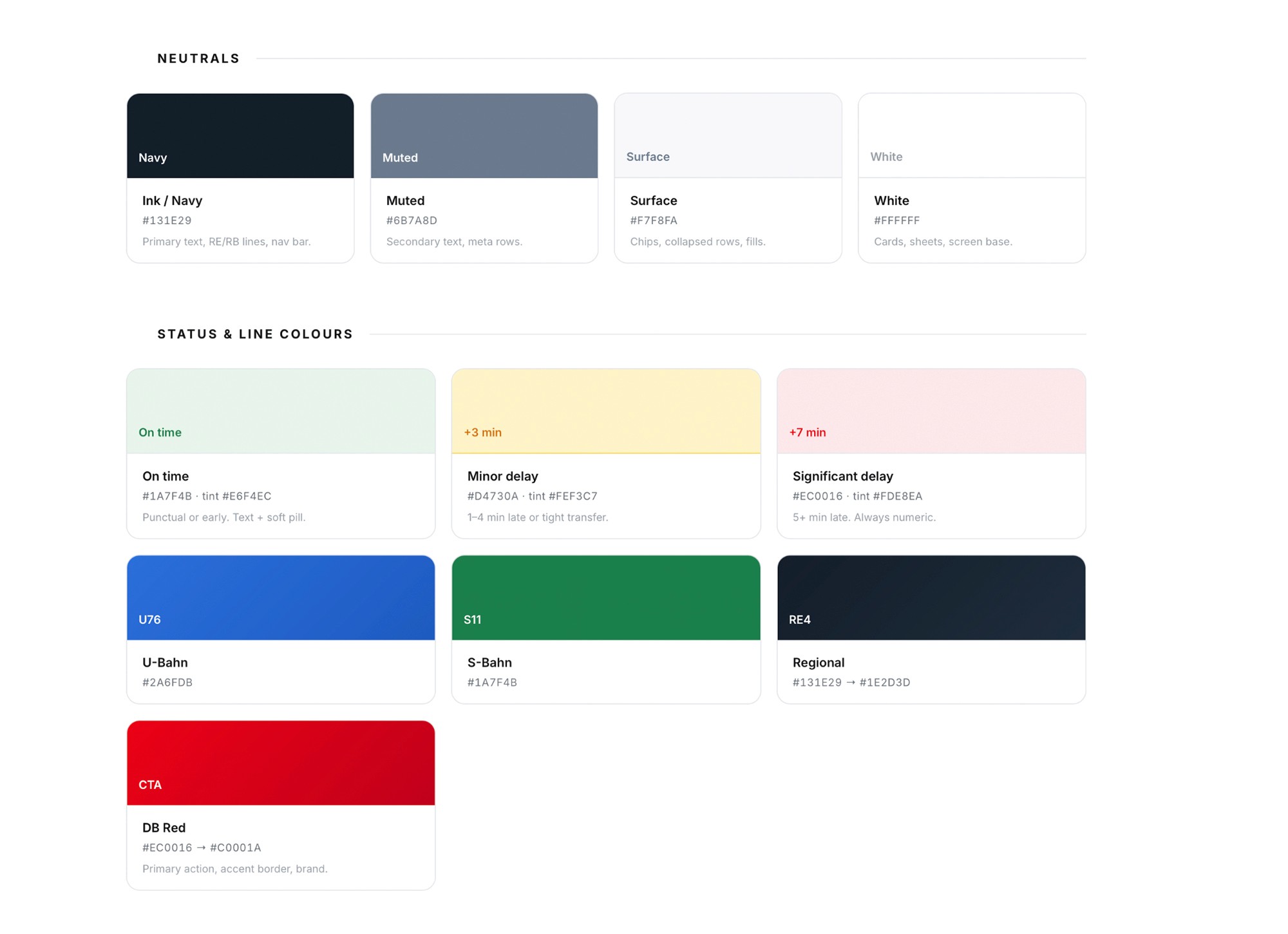
Solution: Green is reserved for on-time departures only. Amber indicates 1–4 min delay, red indicates 5+ min. Every color state is paired with a text label.
Why it matters: Users read green as no problem. Applying it to a delayed departure contradicts a universal UI convention and produces misleading readings.

Problem 05: Past connections polluting the active list
Departed trains appear at full height in the connections list. At 18:19, two of three visible results were already unusable, burying the user's actual task under expired content.
Solution: Past connections collapse behind a single expandable row. The list always opens on the next available departure.
Why it matters: Every extra scroll increases the chance of abandonment. A straightforward progressive disclosure fix.
VISUAL STYLE
The components and tokens behind the redesigned journey-planning flow built around one rule: Status is never communicated by colour alone.
UI COLORS
TYPOGRAPHY

COMPONENTS

HI-FI SCREENS